I had the pleasure of meeting Sara Blua, the Founder of Game Changer New York, through a friend who had developed their donor mapping system. He referred me to her for the redesign work. I was deeply intrigued by their mission to empower disadvantaged youth through sports. I was eager to contribute to a meaningful cause, so I enthusiastically took on the project.
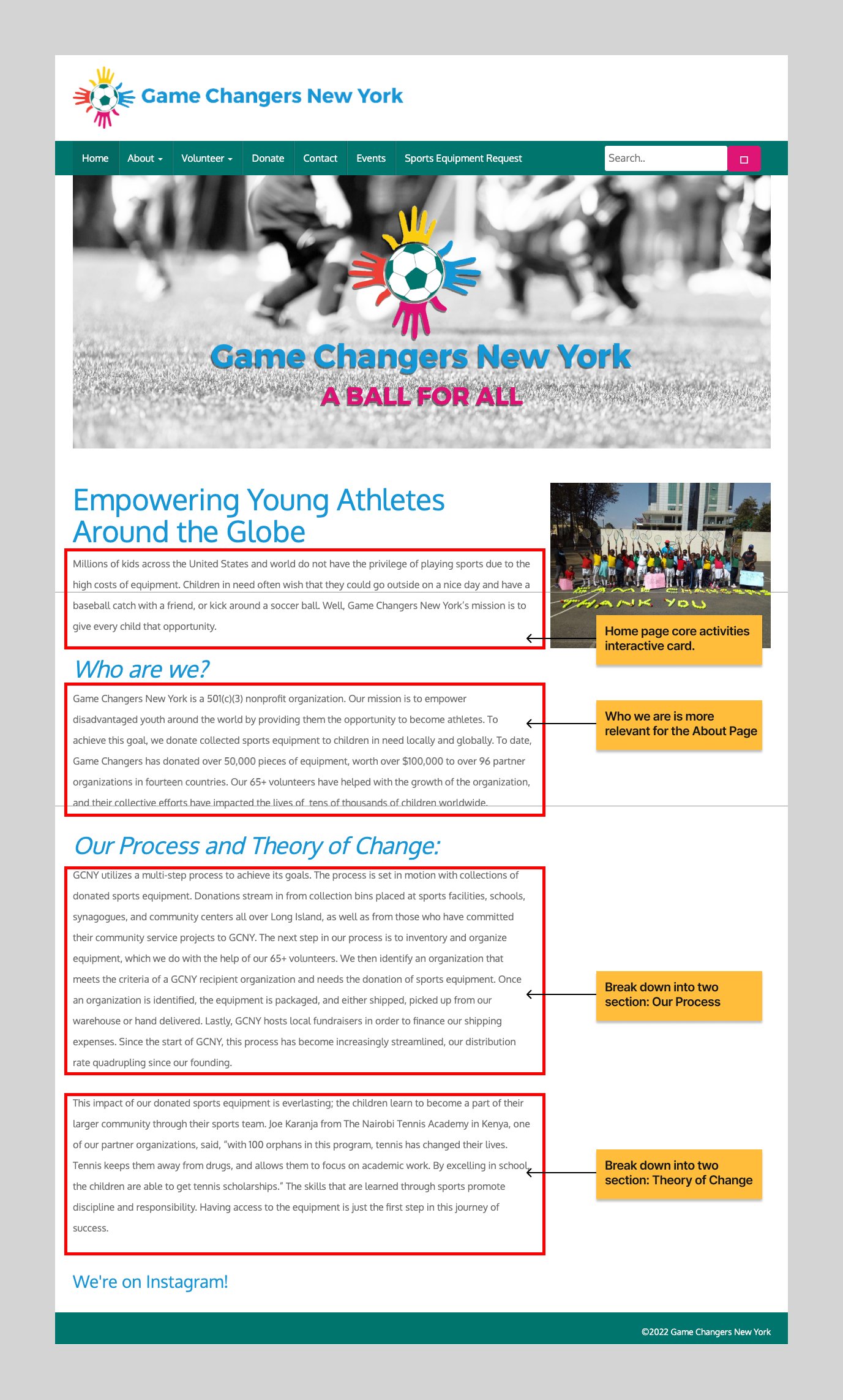
Before

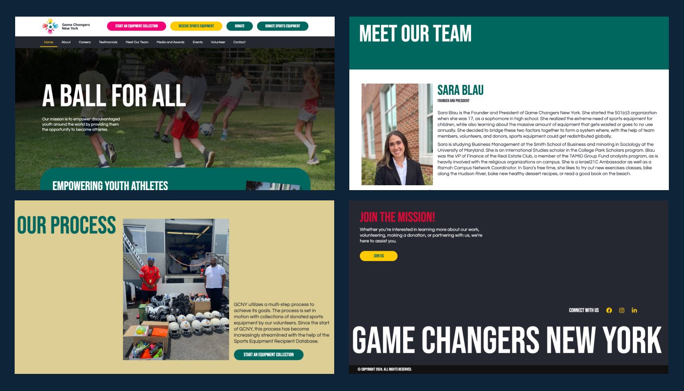
After

During a Zoom meeting with them, I learned about their struggles in showing off their good work on their website. Even though their old site looked old, they kept it updated with good writing. It just needed a better layout. I read all their articles and architect properly into different parts for the new website.
Given its nonprofit nature, traditional competitor analysis was not meaningful. Instead, I examined websites of similar organizations and drew inspiration from charities and non-profilt websites.
Information Architecture:
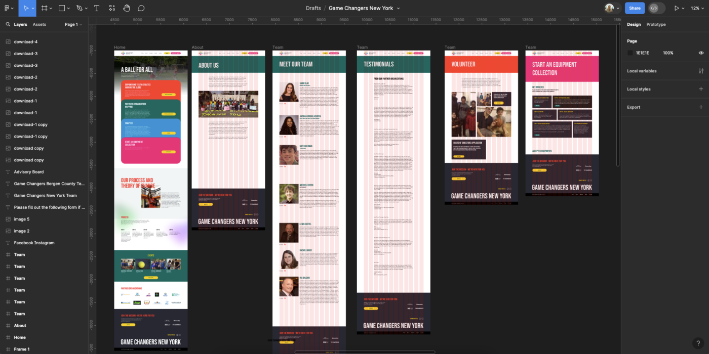
Based on my initial research, I created a site map and structure for the website. I initially opted for two CTAs on the main navigation and after getting the feedback from them, we made it four. I prioritized a visually engaging presentation of their core activities below the hero section with smooth animated in card format.
On their previous website, they had all articles in one single paragraph for the home page, and I broke then down and created Five sections on the home page: Hero Section, Core Activity Card, Theory of Change, Process, and Events.

Design
I made a strategic decision to forgo the traditional wireframing phase, given the project’s nature as a redesign. Instead, I opted to dive straight into high-fidelity design, prioritizing efficiency and expediting the feedback loop. This approach allowed me to swiftly iterate on design concepts and and get the faster feedback. Moreover, I placed a strong emphasis on visual storytelling, leveraging compelling imagery, videos, and graphics to communicate Game Changer New York’s mission, impact, and initiatives effectively.
Central to the design strategy was the integration of Game Changer New York’s brand identity into every aspect of the website. Drawing inspiration from their logo and overarching mission, I meticulously selected four vibrant brand colors to infuse the website with energy and vibrancy. These colors were strategically employed across various elements of the website, from buttons and backgrounds to text and icons, ensuring consistency and coherence throughout the platform. Furthermore, the choice of typography played a pivotal role in conveying the organization’s bold and impactful ethos. After careful consideration, I opted for the Bebas font, renowned for its bold, modern aesthetic and commanding presence.

Frontend Development
I chose to use WordPress along with the Elementor page builder because they offer fleibility and make it easy for the client to update the website as needed. Additionally, Elementor follows standard ADA compliance practices for semantic HTML, which ensures that the website is accessible to all users, including those with disabilities. This choice not only prioritizes user accessibility but also simplifies the process of maintaining and updating the website for the client.
Our collaboration with Game Changer New York presented challenges, particularly regarding project timelines. Despite encountering delays, the client’s flexibility and cooperation were instrumental in maintaining project momentum. Embracing the iterative nature of web development, we prioritized adaptability to ensure smooth progress. This approach led to the successful delivery of a website we are proud of. Sara and her team’s commitment to regular communication fostered a collaborative environment where ideas flowed freely, enabling effective implementation and ultimately contributing to the achievement of our shared objectives.


